Unsolicited app redesign
Hyre is one the most useful apps on my phone, allowing me to live a life without owning a car – and all the hassle that comes with it.
DISCLAIMER: I am in no way associated with Hyre. I did this project to explore how one might improve on an already excellent app.
PREMISE
Hyre is an app that lets you rent cars without going through one of the legacy rental companies. If you need a car for an hour or a weekend, just open the app and find one close to you. Once the car has been booked, you use the app to lock, and unlock the car – no human interaction needed.
INTENTION
As a father of two living in Oslo, the need to own a car is negated by the city’s excellent public transportation system, which I use daily. That said, there are situations where the bus or subway won’t cut it, or it simply can’t go.
Hyre fills this gap perfectly, allowing me to rent different cars for different needs. Short trip to IKEA? I’ll get an electric hatchback (or a van if I need the space). Taking the family on a weekend trip? SUV it is.
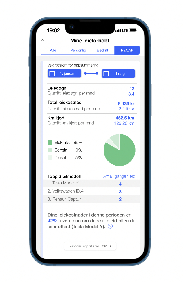
There is one thing I miss however; the app telling me how much money I save by not owning a car. I’d like the app to highlight relevant data from my rentals, in any given time frame. Let me know how many kilometers I travelled in January, or how much money I spent on rentals in 2021.
THE REDESIGN
I tasked myself with imagining what such a feature might look like in the app, and then using Figma to prototype it. Along the way I made some smaller adjustments to the existing design, highlighted below.
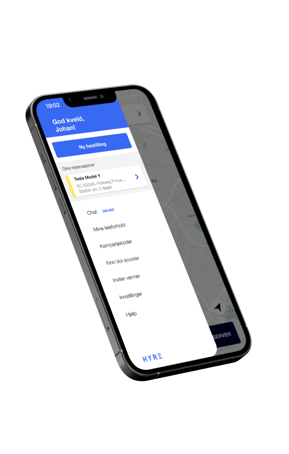
SLIDE-OUT MENU
The main menu is where you navigate the various features of the app, and where you get an overview of your current, upcoming and past rentals.
The adjustments I made here are small, but in my opinion makes for a cleaner look and experience:
I moved the Hyre logo from the top to the bottom in order to make room for a larger welcome message.
The username with the avatar icon in the original design is not clickable, and serves no other purpose than to let you know you are signed in. I changed this to an informal greeting, using only the user’s first name and an appropriate greeting based on the time of day the app is being utilized.
Finally I moved the Chat section to the top, as this is a key feature of the app (customer support is available 08:00 – 23:59 every day of the week), and added a online/offline sign to draw attention to it.


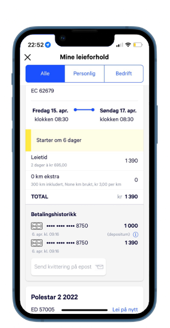
RENTALS OVERVIEW
This is where I want to incoroporate the recap function. In the original design you can choose from «all», «personal», and «business» rentals – by making these buttons smaller there is room for a fourth category as shown in the video mockup.
Furthermore I simplified the list viewing under «all rentals» to feature an accordion style expansion, thus fitting more than just one rental on the screen at a time.
Notice I also added a heart symbol next to the car model, to let the user bookmark preferred rentals.
RECAP
This is where you choose a desired time interval and get all the relevant data from that period in an easy to digest format.
Personally I find the copy on the bottom the most interesting, but most likely also the most challenging to actually code. The math I used in the prototype is not entirely made up: source and source.